No matter how innovative is your business model, your app or website needs to ensure that it offers an optimal customer experience. This customer experience relies on the UI/UX design and the ease of interaction that follows.
To avoid such a failure, you will have to up your UI/UX design game to make your product/service usable. The UI (user interface) takes care of the visual representation of features and the UX (user experience) ensures that the users are satisfied and can perform the intended action effortlessly.
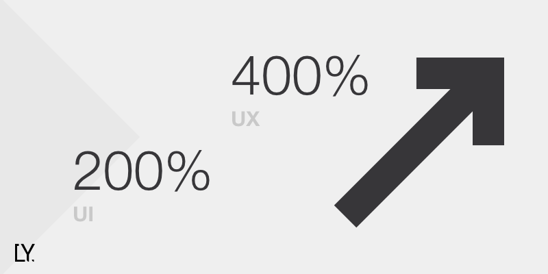
A well-designed user interface could raise your website’s conversion rate by up to 200%, and a better UX design could yield conversion rates up to 400%. — UX Planet
UI/UX design is the backbone of your digital product or service and the app design cost that you initially invest brings multiplied benefits.
In this write-up, we will explore everything around UI/UX design and how to nail customer experience on a holistic level.
What is UI (User Interface)?
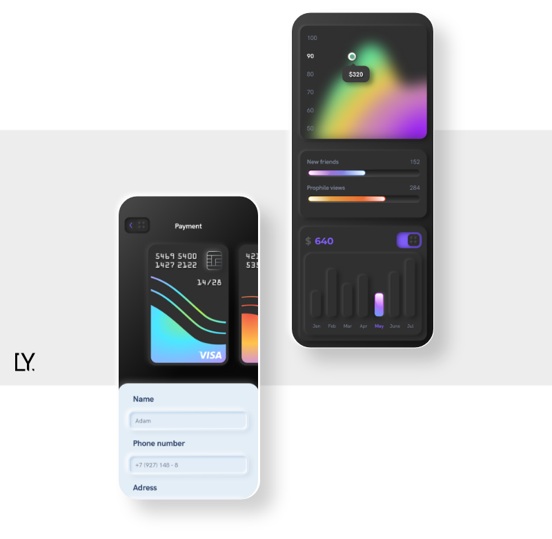
Offers visual delight
The graphical front-end of the app or the website that is visible to the users is known as UI or user interface. In other words, UI is the layout and the visual design of the app or the website. The various UI elements include — buttons, navigation bars, categories, images, animations, videos, and textual content.
Given 15 minutes of time, 59 percent of people will read or browse through something beautifully designed rather than something plain and boring. — Adobe
Even color choices, fonts, spacing, and sizing define the user interface. In simple words, if the UI elements are arranged and categorized nicely and the user likes what they are looking at, you have a good website or app UI design.
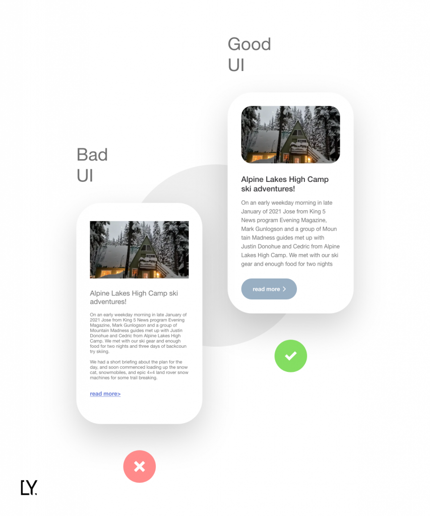
Here’s a glimpse into good UI vs bad UI:
What is UX (User Experience)?
Judges a digital product or service based on usability
User experience is the overall experience of a user when they interact with the app or website. How do they feel about using the interface? Can they find/discover features or they have to struggle to perform the intended action? Is the design intuitive or confusing?
The answers to these questions help in understanding how good or bad is the experience design. For your product to be a success, it is essential to consider user experience seriously because if the users find the experience confusing, you are likely to lose them to a competitor.
Here is an example of a bad UX design. The design below is neither intuitive nor logical — making it a bad user experience overall.

Source: Reddit
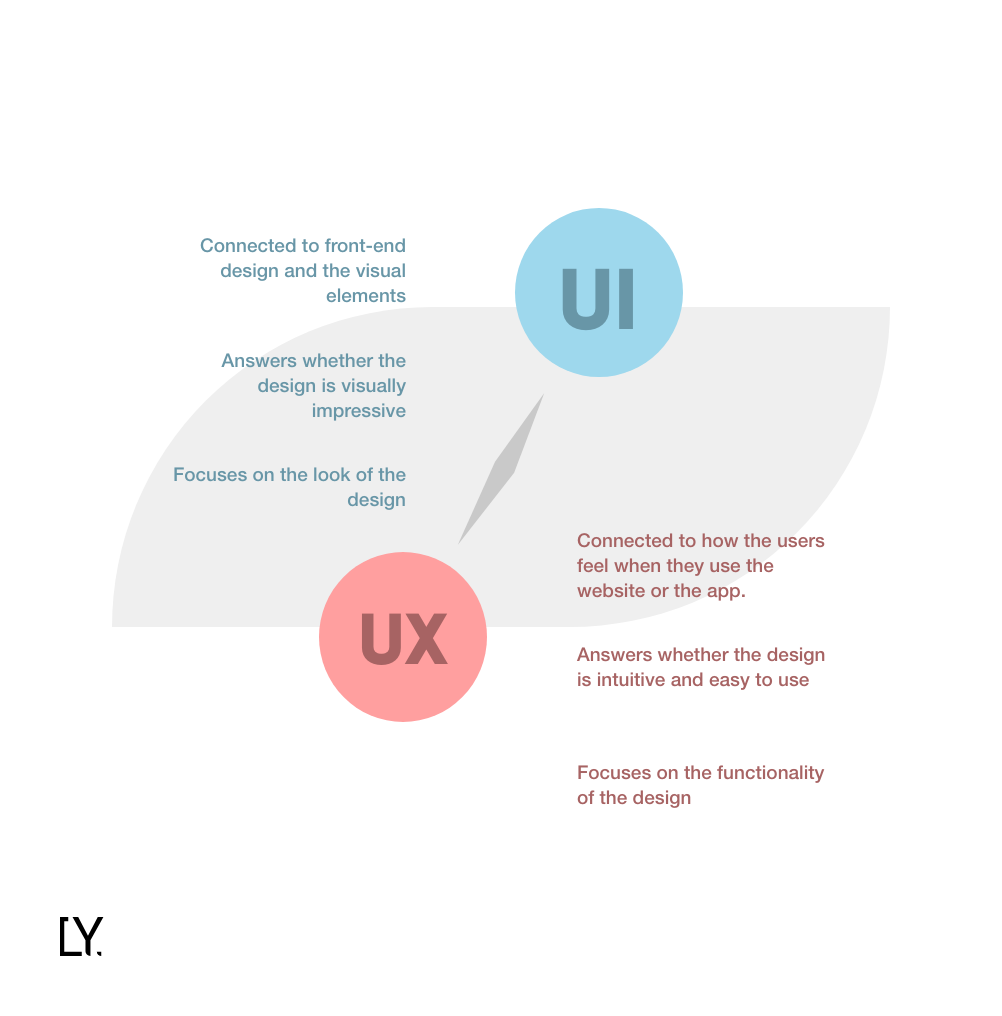
Difference Between UI and UX
User interface and user experience are often treated as a single entity as both of the concepts need to fall in place for ensuring an overall satisfactory customer experience.
The simple difference between UI and UX — UI ensures that the users have a delightful visual experience. Whereas, UX takes care of functionality and user satisfaction.
The table below summarizes the difference between UI and UX in a simplified way:
We can say:
UI (User Interface) + UX (User Experience) = CX (Customer Experience)
Top 10 UI/UX Design Principles
Various principles need to fall in place when designing the user interface. The most critical ones include:
1. Place the control in users’ hands
This principle implies that the user should be able to perform the action they intend to without any impediments across the touchpoints. The users should feel powerful and in control, i.e., what they want is what they are served.
For example, user 1 wants to register through a Gmail account, user 2 wants to register using their mobile number, and user 3 wants to skip the registration altogether. The UI/UX should enable all the registration and onboarding options so that all the users are satisfied.
2. The Interaction Should be Meaningful
According to this principle, you should focus on creating a user interface that only relies on meaningful elements. The UI should be free of unwanted elements that only beautify the design but neither are intent-driven nor add value.
For example, your home page should only be having a hero image, primary tagline, CTA button, your USP in concise words, and some social proof. Adding anything more than that would only ruin the user experience.
3. Lower Down Cognitive Load
Cognitive load refers to the mental power that a user uses to understand a product and its functionalities. However, for creating a powerful UI, you need to make everything natural for the user.
For instance, if the user clicks on the “Buy Now” option, it should redirect to the checkout page automatically. The labeling here plays a vital role too. That is if the label says anything like “Procure Now” instead of “Buy Now” — you’ll be only adding to the cognitive load. Make the design look obvious and intuitive instead.
4. Create a consistent User Interface
Keep your design consistent across platforms, i.e., the design should be similar on a mobile application and the website. If you maintain a consistent UI, you promote intuitiveness, understandability, and usability.
The mobile app, the website, and the mobile web experience should be consistent. i.e., the theme should be the same throughout. Experimenting with the design in this aspect would only lead to losing your brand identity.
5. Comply with User Needs
A good user experience design takes care of the user’s needs. To understand what your users want, you could conduct data analytics based on historical and current data to get a fair idea. Or, you could also A/B test parts of your design to see how your audience engages with it.
Users appreciate reduction of effort when performing an action. If you place appropriate CTAs across the UI/UX design — you’ll be helping them transit from one part of the journey to another — thus, complying with their needs.
6. Maintain a Hierarchy
Hierarchy relates to information architecture, i.e., the organization of your content across the website or the app. With respect to this principle, the content should be well-organized, labeled, and clearly represented.
Site Mapping helps in creating a meaningful information architecture. It helps in illustrate the hierarchy of the categories and content across the design and the parent-branch relationship between them.
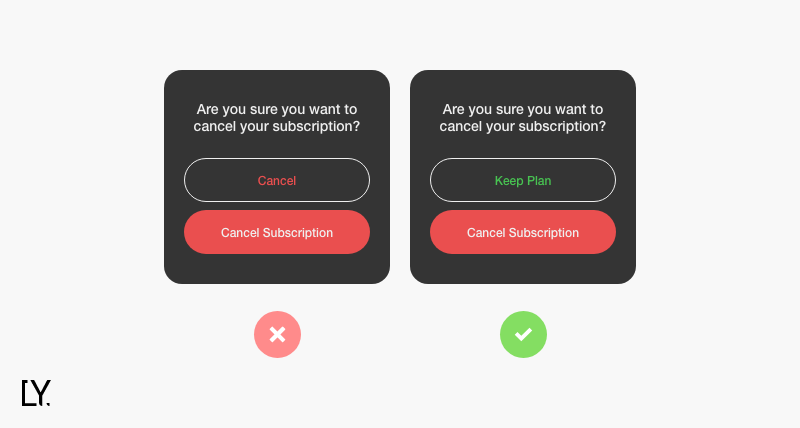
7. Focus on Confirmations
Whenever a user performs a critical action like filling a form or making payments, a confirmation should be taken.
For example, a user makes a wrong choice or changes their mind, the confirmation should be asked to ensure they are certain of the action that follows.
8. Accessibility
Accessibility is one of the most essential parts of the design. According to the accessibility rule, anyone with a disability should be able to access the website/app without much effort. In simple words, your design should be inclusive.
For example, optimizing your user experience design for voice search can help accelerate your efforts in enabling accessibility.
9. Focus on Findability and Discoverability
Findability means that the user can find and use features that they know already exist. Whereas, discoverability means that the user can locate and use features that they are unaware of. Your design should make both findability and discoverability easy.
For example, a user already knows that they can send mails through gmail and can easily compose and send them — that is findability.
But, did you know that gmail has a snooze option that lets you choose emails you want to snooze and then they will only appear after the chosen time frame is over. You didn’t know about this feature earlier, but now you do — that is discoverability.
10. Storytelling
The overall experience that the user has with your digital platform should be holistic and connected, i.e., it should tell a story. With effective storytelling, the different touch points should logically connect without falling apart.
For instance, a user is making a payment — all the screens and the steps involved should follow a path that goes from choosing the payment method to payment acknowledgment.
UI/UX Design: Essential Elements
The design team has to strategically think through the UI/UX before finalizing coming up with a prototype and the fully-fledged design.
There are certain fundamental elements of UI/UX that every design team needs to consider when brainstorming through ideas. Some of these crucial elements include:
1. Human-Centered Design
A human-centered design is an approach that takes the human perspective into account when finalizing the UI/UX design. In simple words, create a design that the human likes and can easily use too instead of adding anything that appeals to the designers but otherwise does not add value to the product.
People ignore design that ignores people. — Frank Chimero, Designer
Another term that resonates with the human-centered design is — ergonomics, i.e., designing your product to make it usable by humans.
2. User Psychology
User psychology is all about stepping in the shoes of your target audience and understanding their likes, dislikes, and needs. Understanding your target audience around these parameters helps in designing better and effectively.
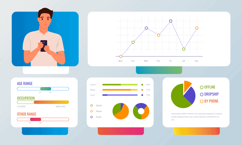
For a better understanding, create buyer persona templates that list down their location, basic information, challenges, needs, problems, etc.
Here’s an example of a buyer persona template to take inspiration from:
3. Typography
Typography is the way you play with your text in the dean — mainly its font, color, and style.
When you are designing, the most important text that you want the user to focus on should be large in size. For example, in a blog — the headline’s font is large but the font size of the content is comparatively smaller.
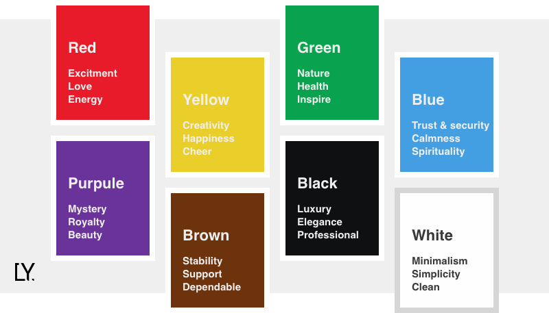
Also, when choosing the font style it should be consistent throughout. Lastly, the colors that you use should complement the overall design and should evoke positive emotions.
Color psychology plays a trivial role here. Here’s an overview of different emotions related to different colors.
4. Design Thinking
Design thinking is a cognitive approach that focuses on problem-solving creatively and practically. By applying design thinking, you can solve complex design problems effectively.
5. Visual Hierarchy
Visual hierarchy means that the website or the app UI design is prioritized and organized based on importance. The most essential elements go at the top and likewise the importance decreases as the user scrolls down the page.
It is similar to the eye testing technique that doctors use. The alphabets that are the largest are placed at the top and as you read through the lines below, the font decreases.

6. Information Architecture (IA)
Information architecture revolves around structuring, labeling, and organizing content across the website/app. A good information architecture promotes the findability of features and their usability.
IA majorly focuses on — clean UI/UX, findability and discoverability, and the ease to perform the intended action.
7. Dark Patterns
Dark patterns are tricks and gimmicks that brands use to lure customers into something they did not intend to in the first place.
A dark pattern is a type of user interface that appears to have been carefully crafted to trick users into doing things that are not in their interest and is usually at their expense. — Harry Brignull, Introduced Dark Patterns
For example, a user can easily subscribe to your product or newsletters but when they wish to discontinue and unsubscribe, finding that option becomes a challenging task altogether. This type of dark pattern is called roach motel.
8. Content Strategy
Design is not a siloed task. The design usually goes with content, which implies that a content strategy needs to be aligned before moving ahead with brainstorming around design and vice versa.
For instance, you are refurbishing your website design. In this case, you will choose a website or app UI design and then plan your content around it. On the other hand, if you are writing a white paper, a blog, or an article — you will draft your content and then decide for its design alongside.
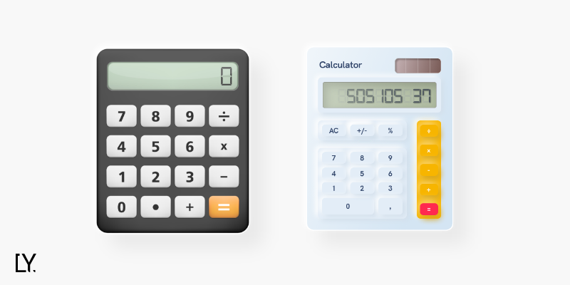
9. Skeuomorphism
In design, skeuomorphism is the designing of UI elements similar to the real-life design of the object. In simple words, if the design of a UI element suggests its usage without much guessing, it follows skeuomorphism.
For example, a digital calculator is similar to the design of a real-life calculator. Why? Because users are familiar with the design and thus find it easy to use it without many challenges.
UI/UX Design Process
The UI/UX design process includes the following stages:
1. Conduct User Research
Understanding your users starts with knowing who your target audience is and what are their pain points. If a similar business model already exists in the market, you will have to analyze where it falls short of meeting customer expectations.
The techniques that can be applied for effective user research include:
- Run User Surveys
- Interview potential target audience
- Run polls across social media platforms
- Create buyer persona templates
2. Ideation
Once you have a fair idea of user problems and their needs, you can move on with the next step, i.e., ideation. This stage revolves around brainstorming UI/UX design ideas that help solve the problems at hand and hence mutually finalizing them.
Some of the best techniques for executing ideation include:
- Braindump — each of the team member writes problem along with the solution on post-its and then shares for review
- Mindmapping — writing problem in the middle of the paper and writing different solutions on the same paper and discussing it later with the group
- Storyboards — visual and graphical representations of user journeys in the form of stories
- Bodystorm — physically enacting scenarios to come up with the best and effective solution to user problems
3. Build Prototype
Once the design team has come up with the best solution, it is time to convert it into a prototype. A prototype is a basic version of the app or the website that validates the UX/UI flow and how the system will enact holistically.
A prototype helps stakeholders, designers, and developers see a near-to-life version of the product. Also, it helps in seed funding as it gives an idea to the investors about your value proposition.
If any changes are required, refinements are made to the prototype, or else if approved — the team moves ahead with the final design activity.
4. Design
The final design is worked upon where the system and the product design are finalized and work is assigned across the team. Here the UI/UX designers and the developers work in tandem to create an app or website.
Each of the touchpoints is designed and then integrated into the system. The team first prioritizes design elements that are essential for the MVP launch and move on with implementing them.
5. Test
Once the design is completed, the quality assurance team tests its working and wholeness. If any errors occur, they are reported back to the developers and designers who again rework to eliminate the bugs.
Usability testing is also conducted at this stage with a set of users to check how they react to the visual design and its functionality. Changes are introduced based on the feedback.
6. Maintenance
When the MVP or the fully-fledged product is launched in the market, the team waits for initial feedback. If any part of the UI/UX design goes amiss, the team will rework it to satisfy user needs.
Further, new features and design changes are introduced in the future depending on newer digital disruptions and changing user needs.
UI/UX trends for 2021
The most popular UI/UX trends that are redefining the definition of design in 2021 include:
1. Vector Graphics
Vector graphics are design elements that are created using shapes, lines, and connecting points — giving the design an illustrative feel. Every other brand (small or big) is leveraging vector graphics as they:
- Occupy less space
- Are engaging
- Are easily scalable
- Can be easily altered
Here’s a vector graphics example:
2. Neomorphism
Neomorphism is an in-between version of a skeuomorphic design and flat design. In this design, the UI elements appear to be placed behind the background. When the user selects or hovers over that element it protrudes out of its background, bringing it to life.
It is similar to a keyword design, where the buttons are a bit raised from the base.
Here’s an example of neomorphic design:
3. UX Writing
UX writing refers to using action-oriented words with your design copy. Write words that complement your design and say exactly what the audience wants to hear is the objective of UX writing.
UX writing is majorly applied to — titles, command buttons, CTAs, labels, radio buttons, descriptions, etc.
UX writing example:
4. Micro-Interactions
Micro-interactions are small moments that improve the interaction between the user and the system. Micro-interactions make a user journey delightful, thus making them like your product more, which further helps build brand loyalty.
To create meaningful micro-interactions, add functional animations along with user actions. For instance, when you hover over a button or make a selection, a small animation validates the user action.
5. Dark Themes
Dark themes are popular and a standard practice that every product follows nowadays. A dark theme allows a user to implement a black (dark) background in the nighttime to save the eyes from exposure to extra brightness and contrasts.
This UI trend also goes on to enhance the UX as this small change focuses on empathy. This design practice is suitable for your website or app if you have more traffic in the evening rather than daytime.

6. Flat Design
Flat design is a UI/UX style that focuses on creating 2D design elements that add simplicity to the overall design. It is also referred to as a minimalistic design that ditches the flashy design.
Brands are using flat design not only for the logos but throughout the interface to improve its likeability. Even vector graphics follow the flat design approach as it evokes positive emotions and cuts through the unwanted clutter.
Here’s an example of flat design:
7. Glassmorphism
Glassmorphism is gaining traction as it improves the overall design and gives it a fresh look. In glassmorphism the UI elements look transparent and follow a multi-layered approach that gives an impression that the different elements are floating in space.
Credits to its glassy and transparent look, that the design is termed as glassmorphism.
Here’s an example of glassmorphism:
UI/UX Design: Best Practices
Some of the best practices for designing UI/UX include:
1. Focus on Creating Omnichannel Experiences
Omnichannel experience means — offering a consistent UI and connected experience across devices, platforms, and touchpoints. By focusing on an omnichannel experience, you are improving brand consistency.
For example, you have an eCommerce business. A customer adds the item to the cart on the app but does not complete the checkout process. Now if they login to the website, they should be able to move ahead from the same step where they left on the app.
This holistic and connected setup improves the user experience and makes their journey delightful.
2. Often Rely on A/B Testing
A/B testing means that you create two versions of a design element to see which one works better in terms of interaction and engagements.
For example, if you are offering a free downloadable resource through a clickable CTA, the designer can create two different versions for it — with both of them varying with respect to fonts, colors, background, text, etc.
Now, you can run the two versions alternatively for a week each and check which one performs better, and stick to it.

3. Follow the Elements of Art
The seven elements of art that you need to follow across your UI/UX design include:
- Line: By adding lines, you create a sense of understandability of objects on the user interface. In simple words, lines help distinguish between elements on the interface.
- Shape: The different shapes of the objects on the interface should evoke familiarity. For example, a hamburger icon is created by placing three small parallel lines. People are familiar with the shape and understand what it does when clicked upon.
- Space: Every element on the interface should be appropriately placed. In other words, a balance should be maintained — neither too many whitespaces nor too much clumsiness.
- Texture: This is about creating a visual texture created by playing with other elements such as color, lines, and shapes. The right texture describes a feeling and sets out a meaningful experience.
- Size: Focus on the sizing of different elements of the design. The images, the text, and the other design elements should be clearly visible to the naked eye and should appropriately fit to the screen irrespective of the device one uses.
- Color: Using the right color combinations is highly important for UI/UX designers. Colors are associated with emotions, which is why using subtle and colors related to positive emotions should be prioritized.
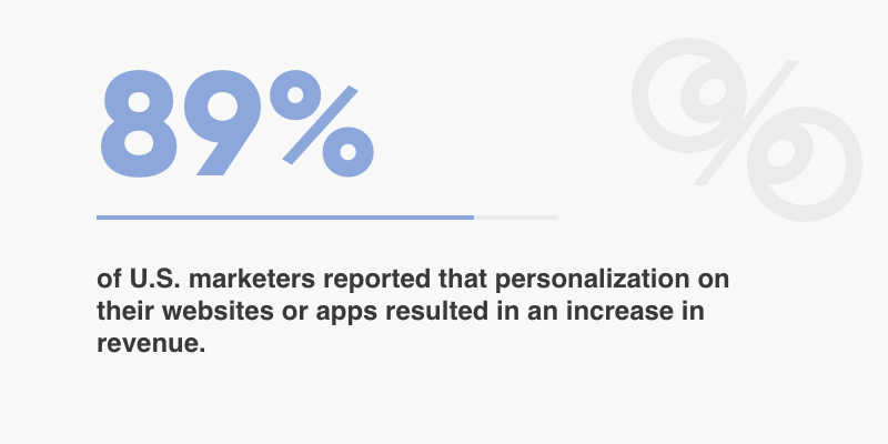
4. Focus on Personalization
Personalization is changing the UI/UX design based on individual users and their preferences. This is best implemented by Netflix, where the content feed depends on users watching history.
The homepage content of Netflix is different for every user. Another example could be Amazon, which showcases products related to the customer’s past purchases.
Personalization enhances the user experience X times and makes a customer stick to the brand. For implementing personalization, implementing machine learning and recommendation systems is imperative.
5. Try Repetitions
Repeating a UI design element across touchpoints and platforms means that you are trying to build brand consistency. This practice strengthens the design and keeps it connected throughout.
For example, the menu and the logo placed at the top stay consistent throughout the user journey — whether they are on the home page, discovery phase, or the checkout phase.
This makes the users feel powerful and gives them control, thus improving the user experience on the whole.
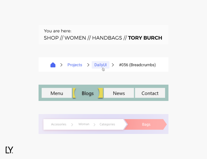
6. Rely on Breadcrumbs
These are the little trails that the designer leaves to help a user understand — what part of the journey they currently in. It is related to giving users control over design and adding awareness to their journey.
These breadcrumbs are placed at the top of the mobile app or website and are clickable too (in case the user needs to return to the previous journey phase).
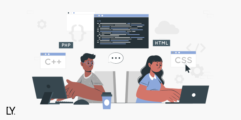
7. Follow Collaborative Design Practice
Collaborative design practice is the process where designers and developers work together to create an app or the website. The collaborative design practices solve the problems associated with working in silos.
For instance, a designer comes with a finalized design but it is not technically feasible to implement. In this case, the design efforts would be a waste.
This is why, working collaboratively to solve a problem is the best solution. It helps trim down the app or website design cost while ensuring faster time to market.
UI/UX Designers + Developers = Collaborative Design
Conclusion
UI/UX is the backbone of your website or app. Without a powerful user interface and user experience, your innovation will not make the desired difference and will eventually fail no matter how unique your app idea.
In this write-up, we covered everything about UI/UX design and how it is a crucial element to consider when you create an app or a website.
To begin with your product development journey — hire a website design company or a mobile app design company that understands your vision and holds experience in the field.
Design is your brand’s organic business evangelist. Make sure it creates a lasting impact both on visual and functional aspects.